Why advanced stats aren’t optional anymore

In modern football, watching the game “with the naked eye” and then checking the score is no longer enough. Teams, scouts and even fans lean on advanced metrics to understand what really happened beyond the goals. Expected goals (xG), heat maps and duels won sit at the core of what people usually call estadísticas avanzadas fútbol xG, a toolbox that tries to turn the chaos of a match into something measurable. The key is not to worship the numbers, but to treat them as another camera angle: they won’t replace your eyes, yet they reveal patterns you’d easily miss in real time. To interpret them well, you need clear definitions, a feel for their limits and the habit of constantly comparing what the data says with what you actually see on the pitch.
So what is xG exactly – and what is it NOT?
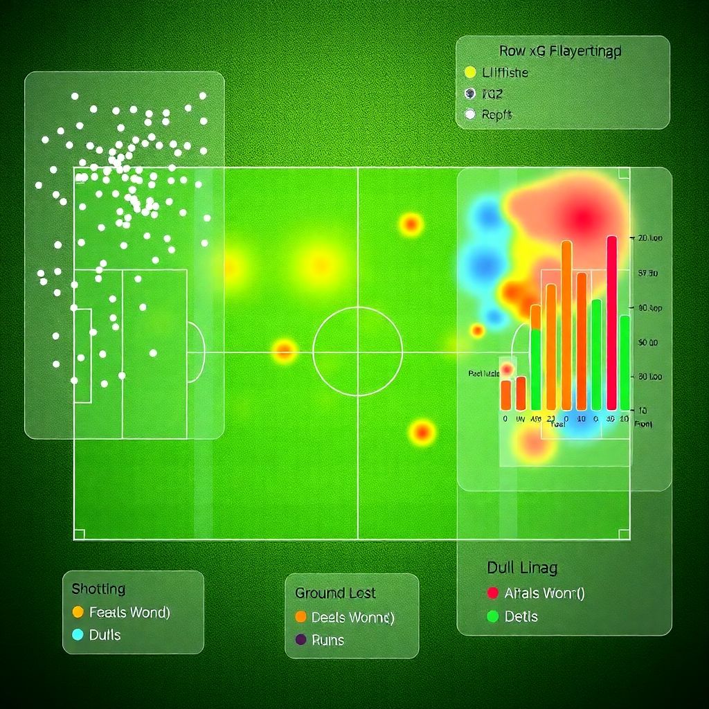
xG (expected goals) estimates how often a given shot becomes a goal, based on thousands of past attempts with similar characteristics: distance, angle, body part, type of assist, presence of defenders, and so on. Imagine a scatterplot: the pitch seen from above, every shot as a dot, with bigger circles for higher xG; a shot inside the six-yard box in front of goal might be 0.5, a long-range blast under pressure 0.03. Add up all shots and you get team xG for the match. Crucial nuance: xG is not a prediction of the exact score; it’s a probability-based description of shot quality. You can lose 1–0 while having 2.0 xG and conceding only 0.3 xG. Using xG well means asking “who created better chances?” instead of only “who finished better today?”, and confronting that answer with your tactical reading.
Heat maps: X‑rays of space and behaviour
Heat maps show *where* events happen, turning the pitch into a density diagram. Picture the field divided into tiny cells; each touch, defensive action or sprint paints a bit of colour, from cold blue (few actions) to burning red (many actions). In an análisis de partidos de fútbol con xG y mapas de calor, xG tells you about chance quality while heat maps explain *how* those chances emerged spatially. A full-back’s heat map, for instance, can reveal whether he truly played as a defender or behaved like a winger constantly attacking the half-space. The trick is to know what’s being mapped: touches, progressive carries, pressures? Two heat maps with similar shapes can mean different things if one shows touches and the other shows pressing. Without that detail, you risk drawing conclusions from a pretty picture that’s actually measuring something else entirely.
Duels won: the most misleading simple metric
“Duels won” sounds straightforward: who came out on top in individual clashes. But even this basic stat hides layers. A duel can be aerial, ground, offensive, defensive; it might happen in your own box or near the opponent’s corner flag. Think of a vertical bar diagram in your head: one bar for total duels, split into green (won) and red (lost), then broken down by zones. A centre-back winning 80% of duels but only engaging in a few might be less valuable than a midfielder with 55% success but in twenty high-pressure actions. Interpreting duels means asking: where did they occur, against whom, and what was the game state? That’s why relying on duels alone often overvalues physical dominance and undervalues intelligent positioning that prevents duels from happening in the first place.
Combining metrics: from raw numbers to tactical context
The real power appears when you layer these stats instead of reading them in isolation. Imagine overlapping diagrams: a heat map of a winger’s touches, small xG bubbles at each shooting location and arrows showing duels contested along his flank. Suddenly patterns jump out: maybe his xG comes only from cutbacks after beating a full-back wide, or perhaps from drifting inside into the half-space. Modern software análisis estadístico fútbol xG mapas de calor makes this kind of multi-layered view almost trivial technically, but interpretation is still an art. You need to match what the data suggests with tactical principles: team pressing height, rest defence, build-up structure. Done well, this combination explains not just what happened, but *why* it kept happening, revealing repeatable mechanisms instead of one-off moments of brilliance or mistakes.
Learning the language of data without losing the game

Because there’s jargon everywhere, a structured curso análisis de datos y estadísticas avanzadas en fútbol can be helpful, but you don’t need to become a full-time data scientist. Think of it as learning a second football language: xG, heat maps and duels are vocabulary, models and visualizations are grammar, and your tactical understanding is the underlying meaning. Start by watching a full match, writing down your impressions, then checking the postgame data: did the xG match what you felt? Do the heat maps confirm the zones you thought were overloaded? Where they don’t match is where you learn the most. Over time you’ll spot common traps: confusing volume with quality, assuming correlation equals causation, or treating a single game’s numbers as definitive proof of a narrative.
From analysis to prediction: using stats without crystal balls
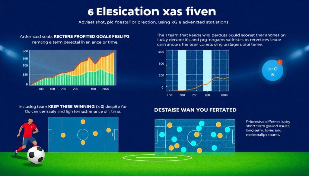
When people talk about pronósticos de fútbol con xG y estadísticas avanzadas, they often imagine some magic model spitting out exact scores. Reality is subtler: advanced metrics help you estimate how sustainable a team’s performance is over time. A side that keeps winning 1–0 with low xG for and high xG against is probably riding their luck; another that consistently creates better chances than it concedes, even if results lag, is likely to climb the table. Here, diagrams become timelines: picture a line chart of rolling xG difference per match, overlaid with actual points gained. Where the two diverge heavily, you can expect regression. The most grounded approach blends this trend analysis with injuries, schedule difficulty and tactical changes, accepting that good forecasting narrows uncertainty; it never eliminates it.